

HP Lakhani Associates Office
Office
HP Lakhani Associates
An open shell space gave us the liberty to design an office to meet our requirements and explore all possibilities in terms of space planning, material usage and provision of services.
Maximum usage of green building materials, natural organic finishes etc. have been used to create the interiors and the external terrace space. The complete electric power consumption is being generated by solar energy and wind mills except for the power consumption required for running the air conditioners. The entire office is integrated with automation system and can be controlled through an iPad. Along with meeting our requirements we have tried to display the different material usage and finishes to our clients that are available today for their better understanding.
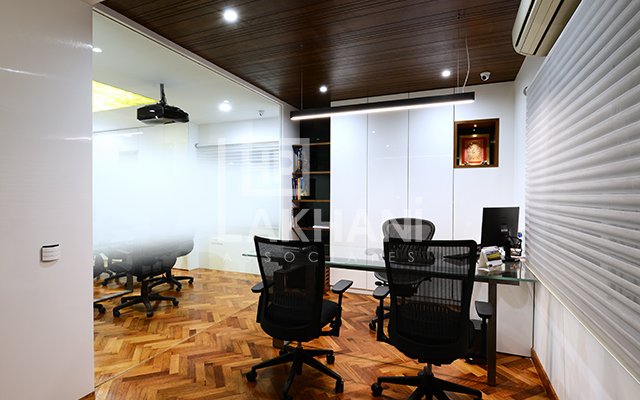
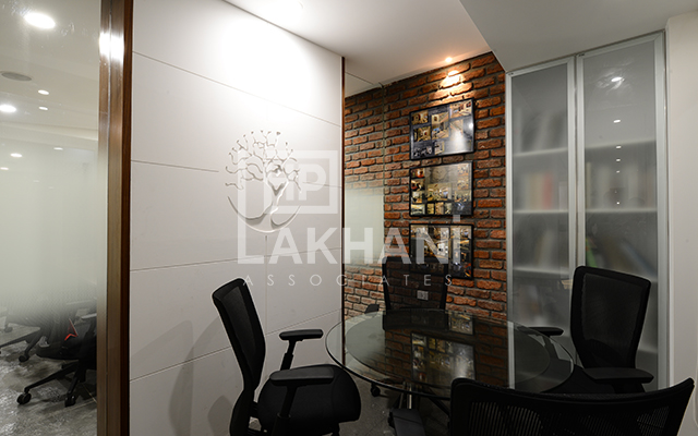
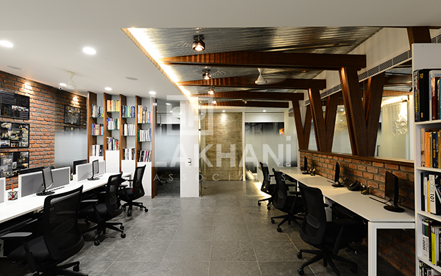
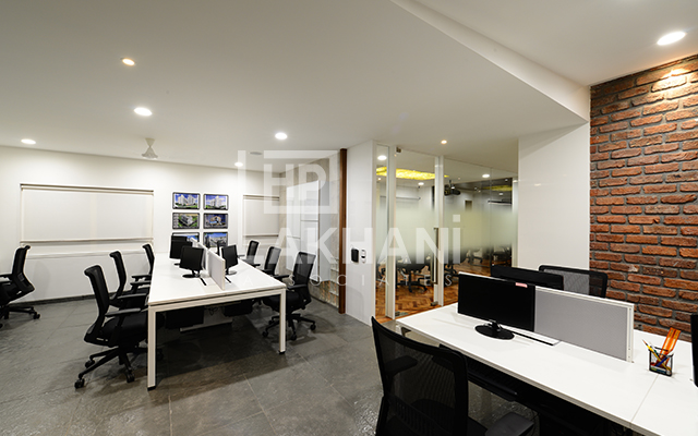
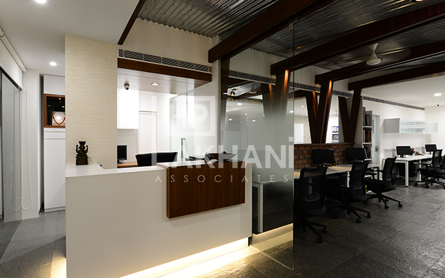
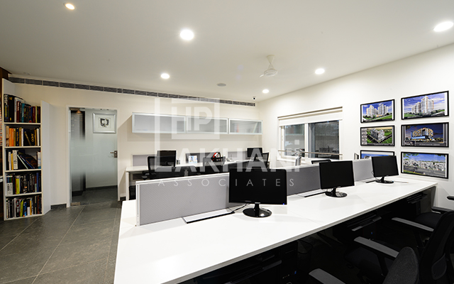
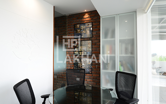
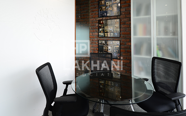
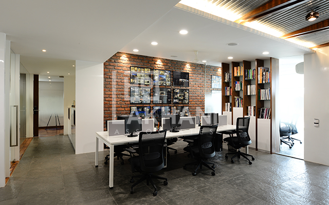
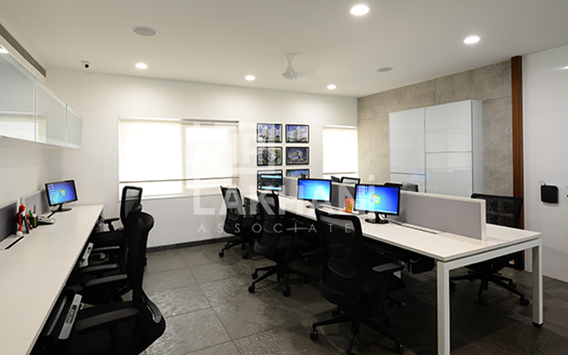
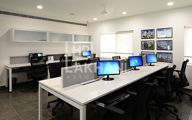
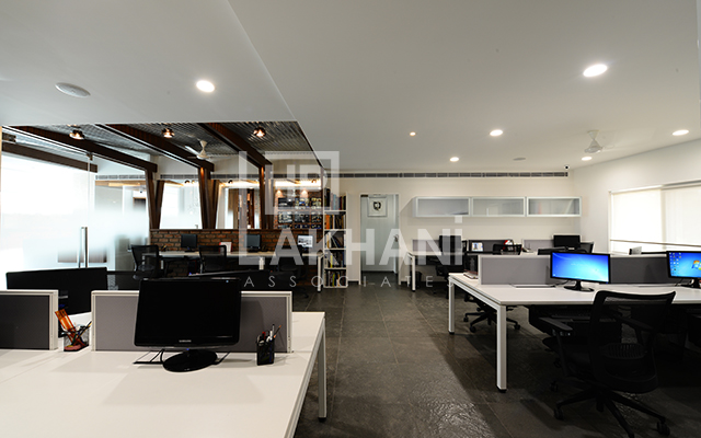
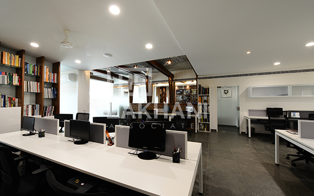
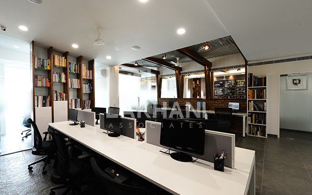
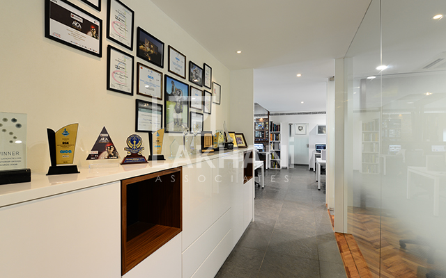
The plan was generated to make optimal use of the given floor plate with complete vaastu compliance. An open plan main studio is at the center of the office, while all the services have been segregated at one end behind an existing wall. The main reception area is a large space with an additional work station provision for the accounts department. A small meeting room at the entry, serves the dual purpose of a waiting area, meeting room with contractors and vendors, and storage space for material samples. The glass walls provide the necessary physical separation between the spaces but allow the visual link with the interior spaces. The main studio is defined into two zones with the wall finish provided and the passage that leads to the conference room and the principal architect’s room. Opposite the passage at the other end of the studio is a door which opens into the service core which houses the pantry, rest rooms, filing cabinets, printer station, and storage of catalogues, stationery and other important files.
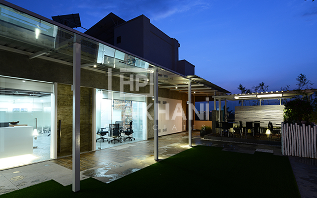
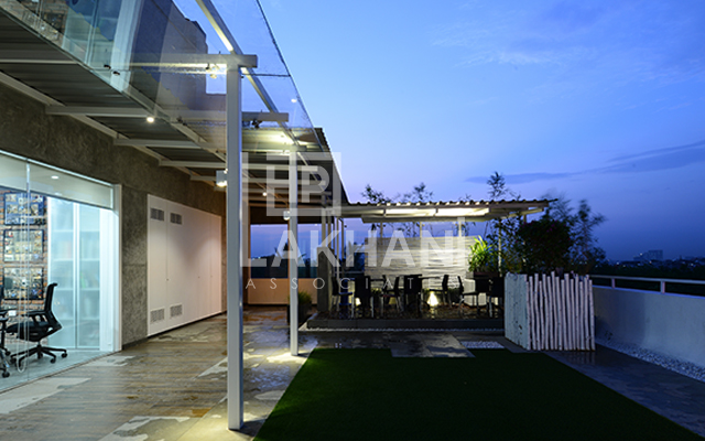
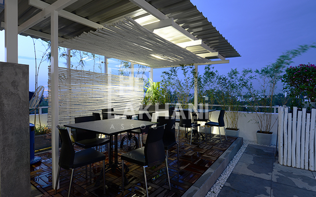
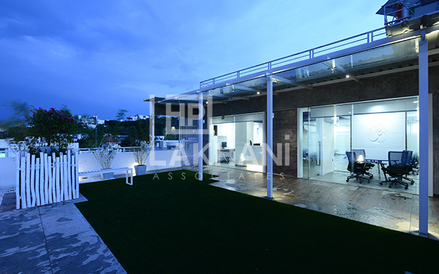
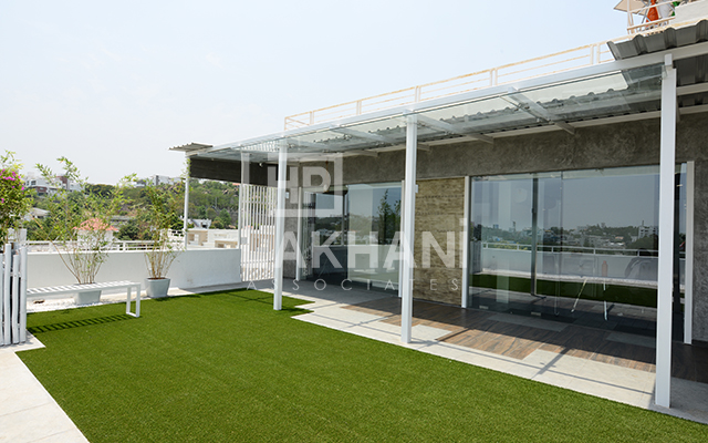
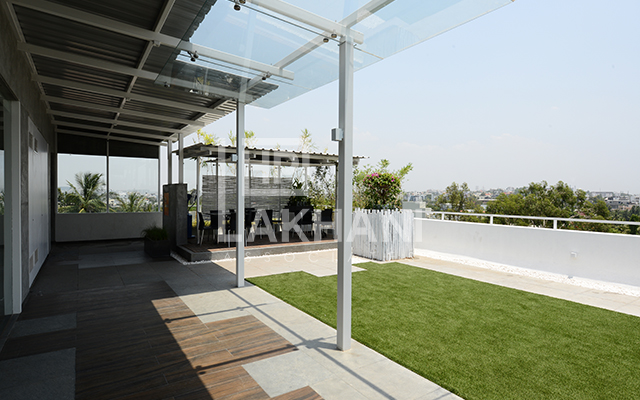
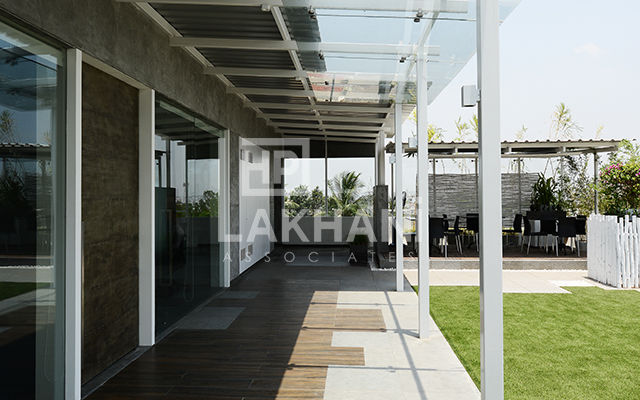
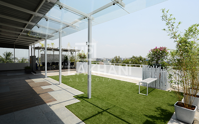
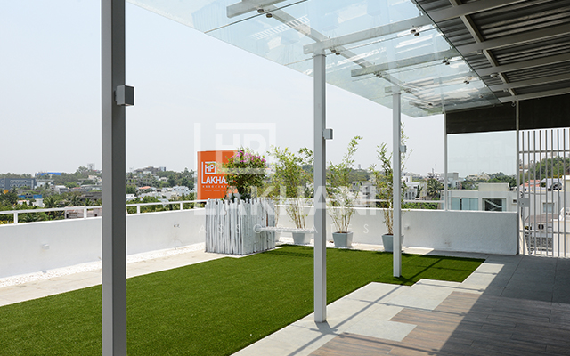
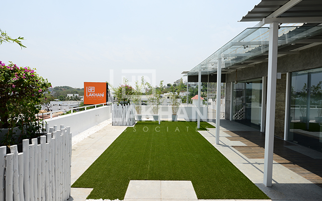
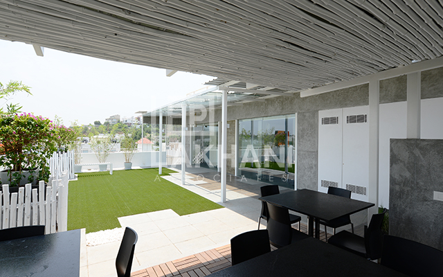
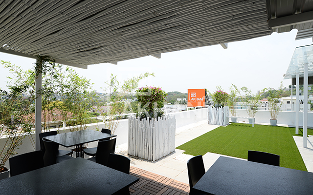
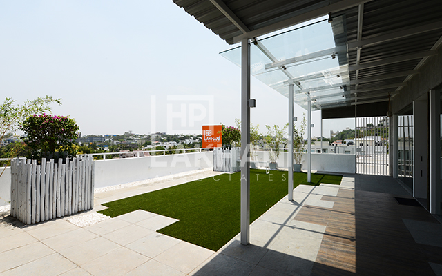
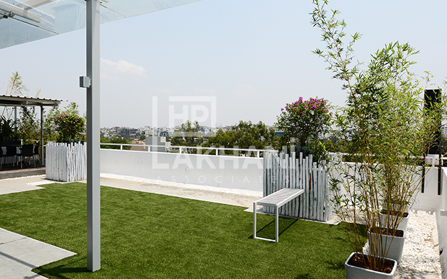
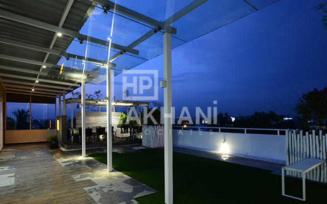
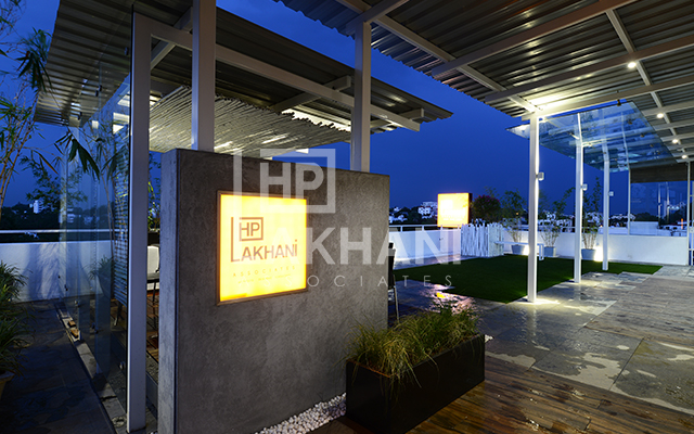
The open terrace in front of the built space is an additional spill out area, with a semi-open dining area created surrounded by potted plants and overlooking the lawn done in artificial turf.
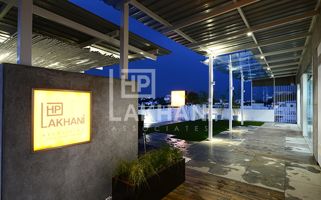
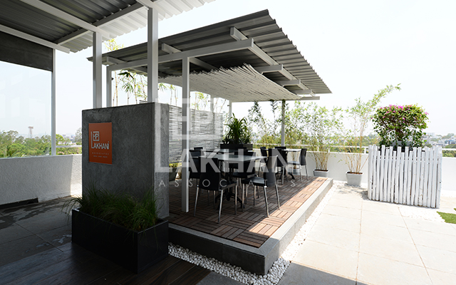
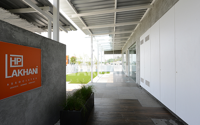
Large entry door finished in antique metal sheet greets one at the lift lobby. A baffle wall in concrete texture finish is positioned at the entry with the company logo done in acrylic on it which is backlit. The dining deck is behind the baffle wall and the pergola defines the pathway to approach the main entry. The verandah pergola and the cover to the dining area have been done in mild steel fabrication with corrugated sheet cover. Touch of glass has been added in front of the main entry for a contemporary look. The dining area has bamboo shafts tied and hung to create a false ceiling and they are also added at the back between the vertical posts to complete the look. The raised level has wooden deck flooring and is surrounded by white pebbles. The complete terrace flooring is done in natural tandoor stone combined with wooden finish tiles and pebbles around the artificial turf. Existing column stubs on the terrace have been camouflaged by bamboo walls and have planter boxes over them. Potted plants round the parapet wall complete the garden look with a small metal bench fixed to one of the column shafts. An existing large niche along the external wall has been designed to house an outdoor pantry, and storage space. The shutters to these are made from wood and plastic waste and is a biodegradable material, good for external use.
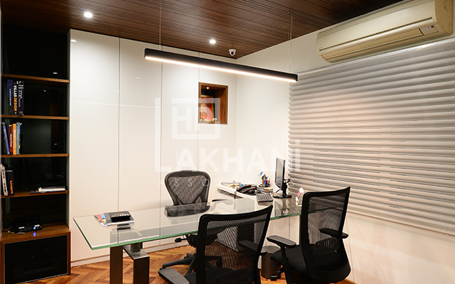
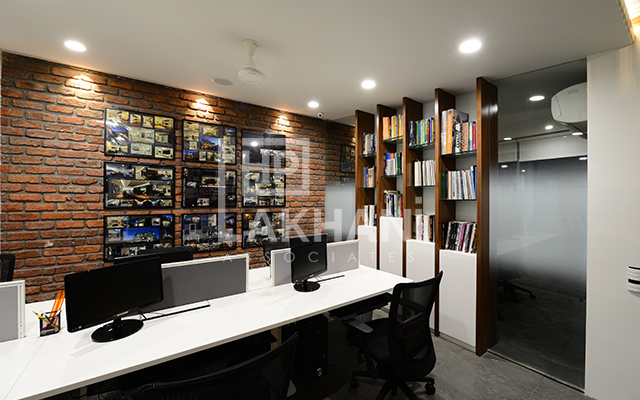
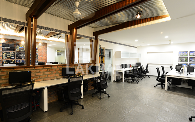
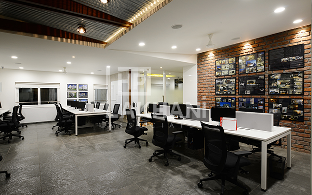
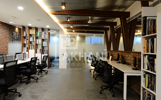
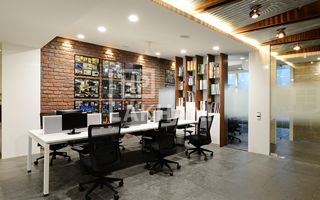
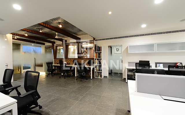
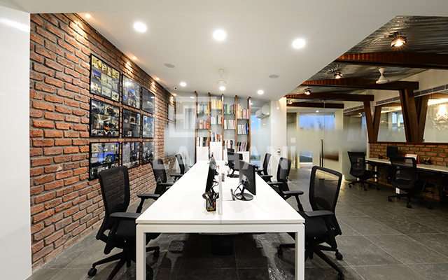
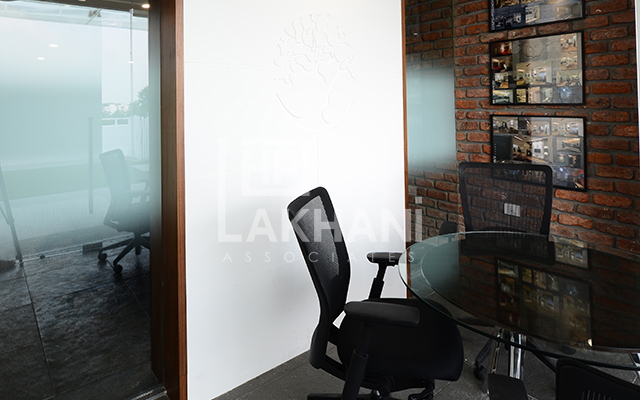
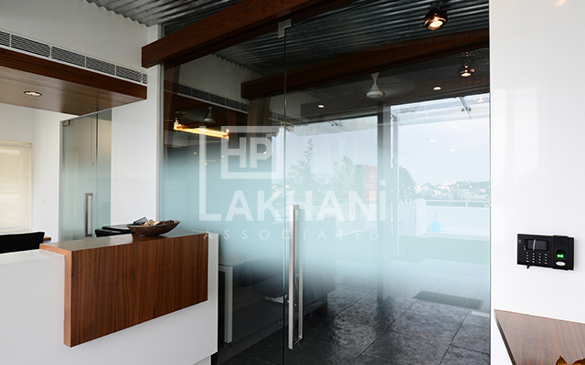
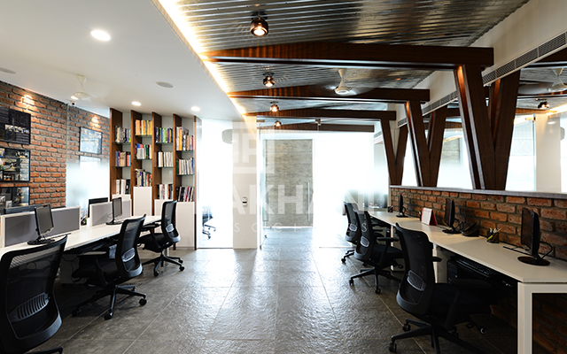
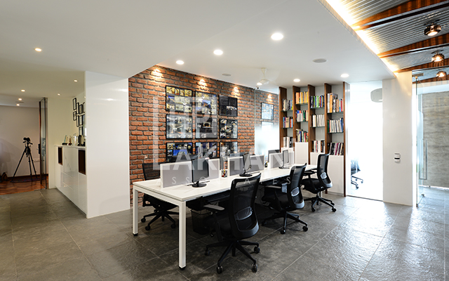
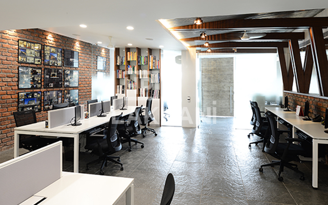
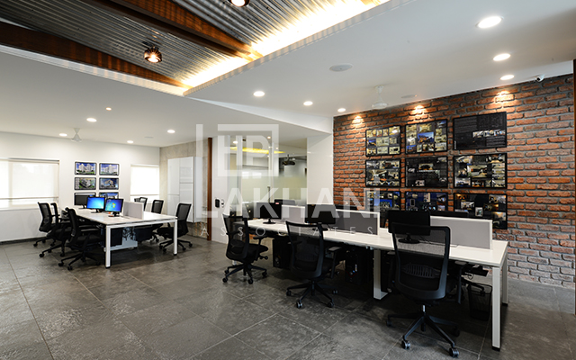
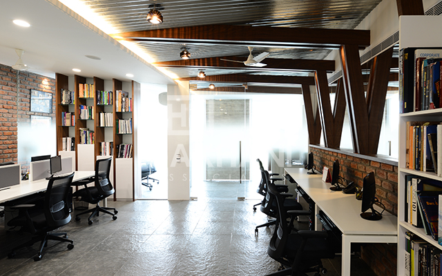
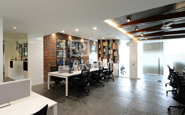
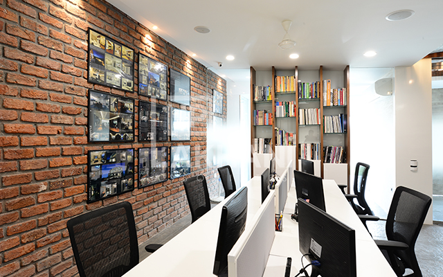
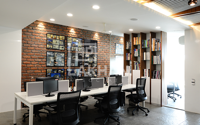
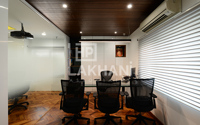
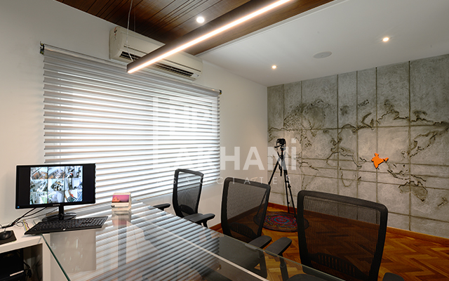
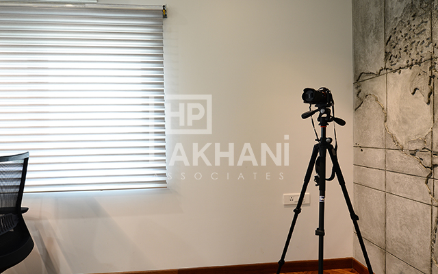
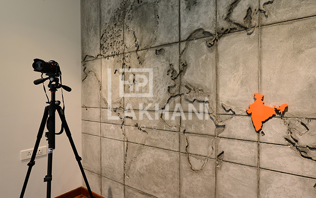
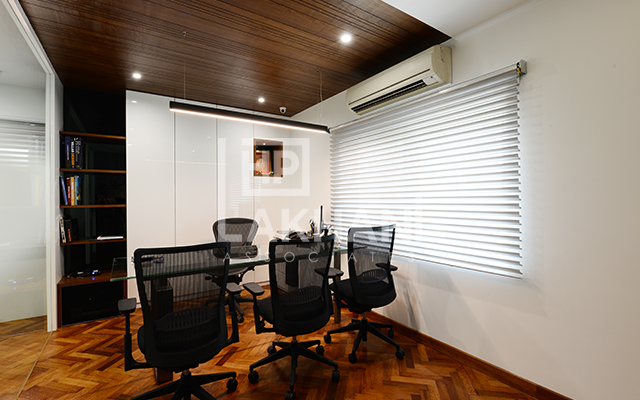
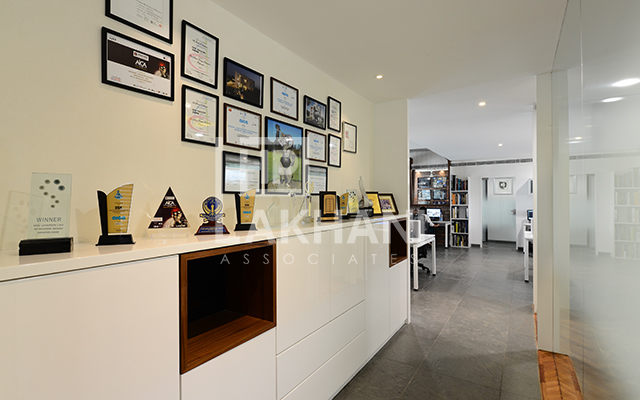
The main door to the office is similar to the lift lobby door and is centrally placed between clear glass walls. The complete flooring of the office is done in natural tandoor stone except for the conference room and the MD’s room which have a wooden flooring. Part of the walls in the main studio are done in an exposed brick finish while the rest are all painted white. The complete external wall surface has a concrete texture finish similar to the baffle wall. The back wall of the MD’s room has a world map cnc cut in mdf done which is also in the same concrete texture finish. Only India is highlighted in Orange the company logo color.
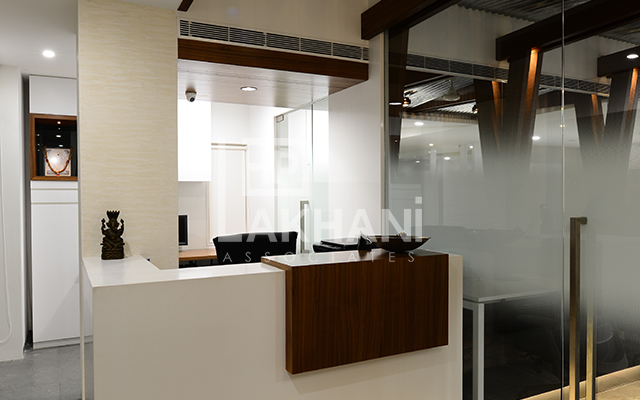
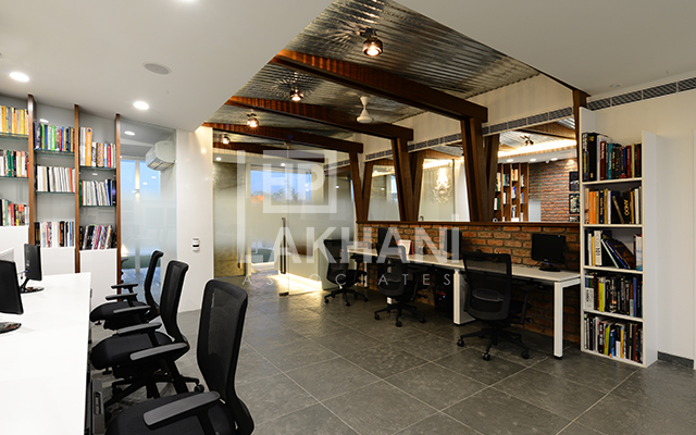
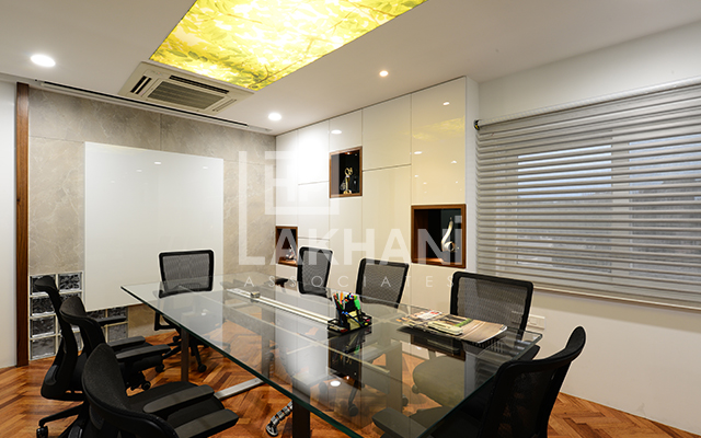
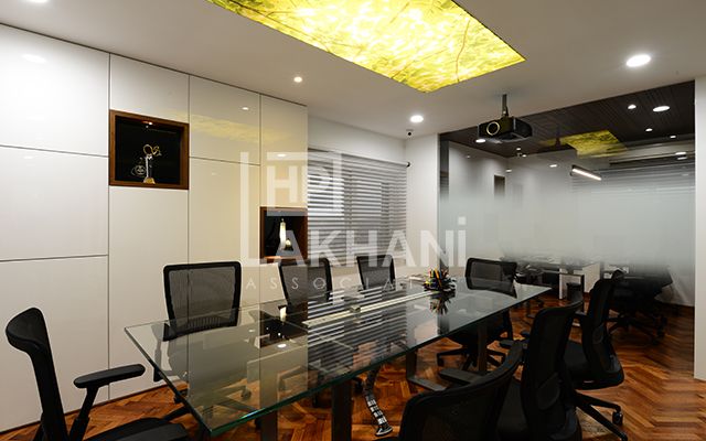
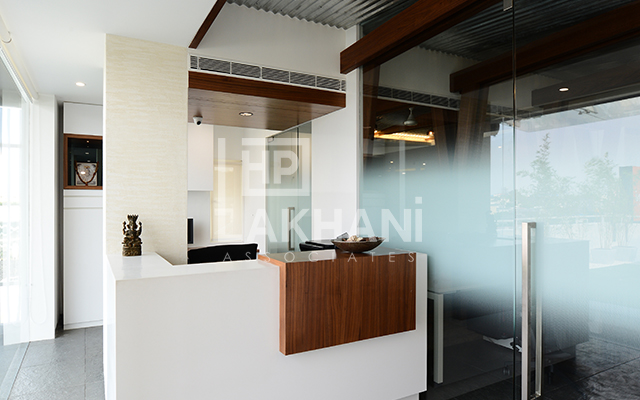
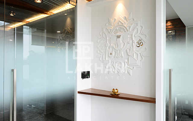
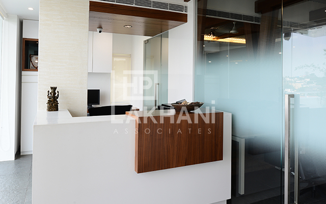
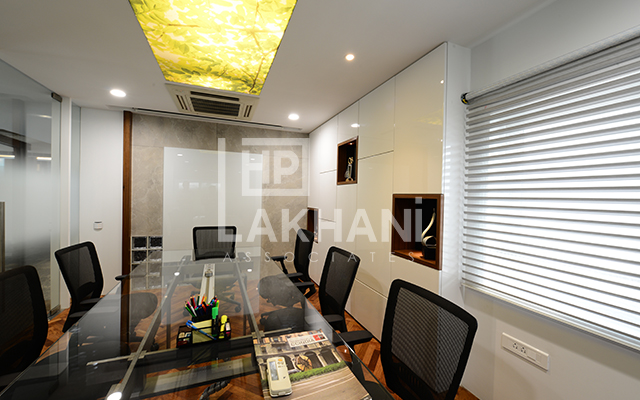
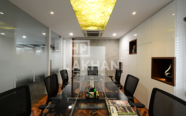
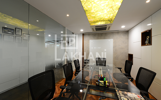
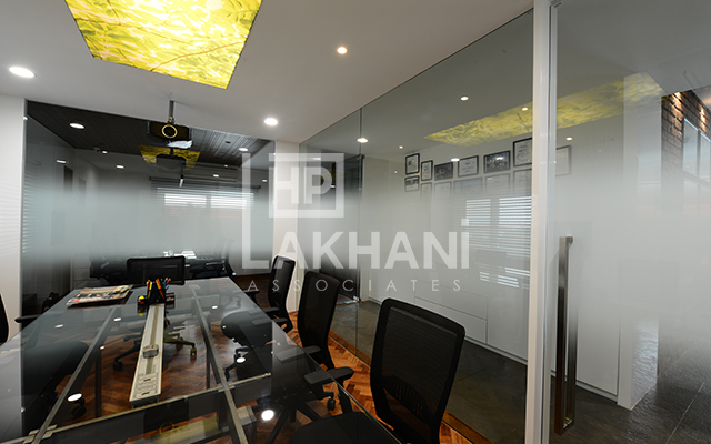
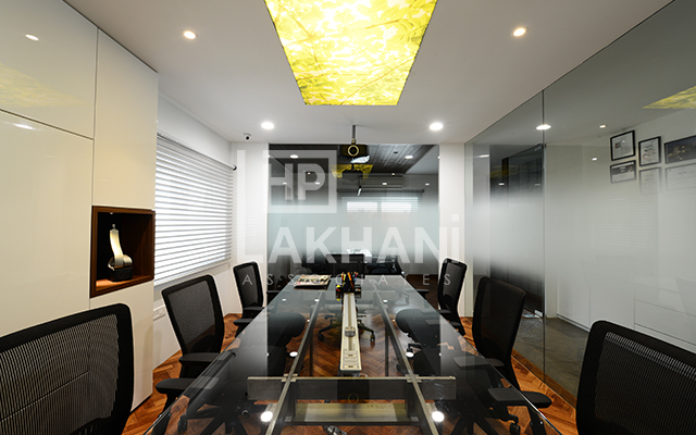
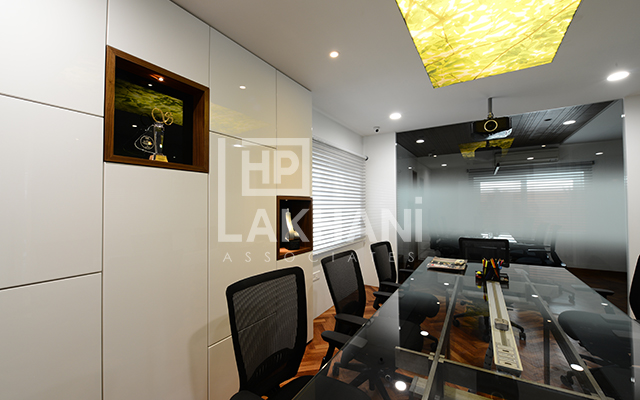
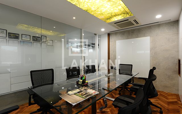
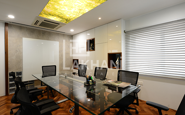
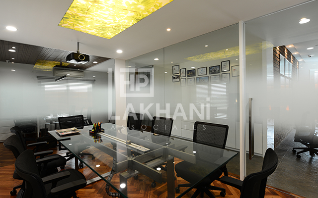
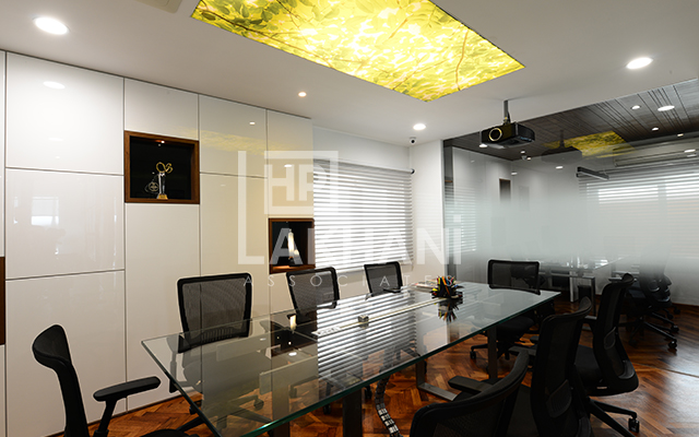
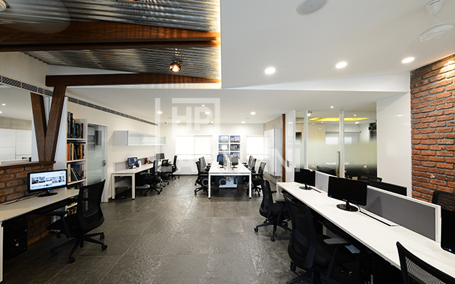
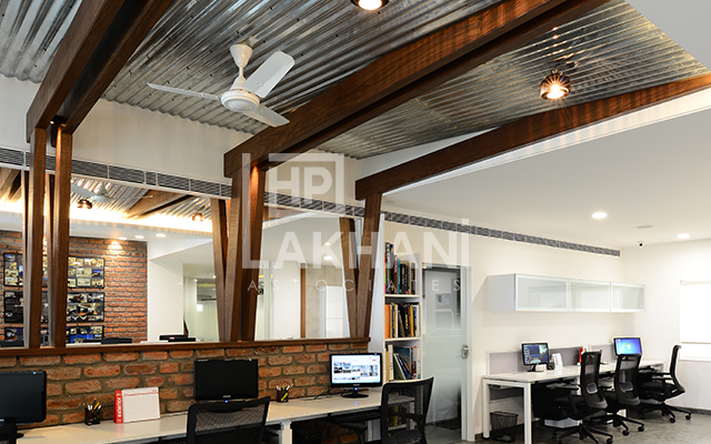
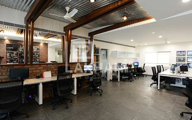
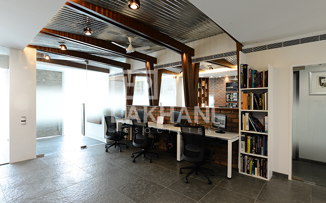
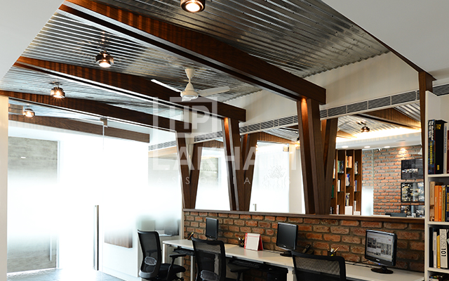
One is greeted by a white Ganesha mural done in mdf and lacquer finished with a touch of silver in the reception area. The reception table done in white corian has a veneered ledge with concealed lighting at the bottom. The existing column has a travertine texture finish. The false ceiling is a combination of POP with part of it done in GI corrugated sheet which also continues into the main studio. A tree of life mural also done in mdf adorns the wall facing the entry glass in the meeting room. Part of the false ceiling in the main studio is the same GI corrugated sheet which is further accentuated with slanting wooden rafters which continue vertically down along the mirror face. The mirror cladding on one wall in the main studio reflects the opposite brick wall and the display of the project boards. Modular workstations with ergonomic chairs are being used for greater working comfort. The open plan allows a free flow of communication and ideas across the studio. The conference room false ceiling is a printed fabric over the glass table which is backlit and gives one the feel of sitting below a tree in the open for discussions, while the MD’s room has a false ceiling done in rough veneer with random grooves.
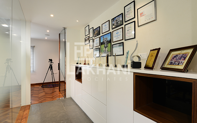
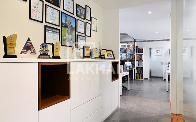
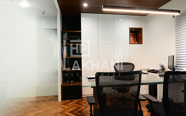
All the glass walls are partially covered with a texture film at the center to provide privacy across spaces which otherwise feels like one unified space. The storage cabinets in the different areas have been done in different finishes like, laminate, pu and lacquer. This has been done for the benefit of the clients for them to understand the difference between the finishes. The partition wall of the conference room has a white lacquered glass finish which can also be used as a white board during meetings. Part of the separation is done with glass bricks to create an interesting element.
The conference table and the MD room table have been designed by the in house team and fabricated on site in ms sections with glass tops.
September 21, 2021


